What do you think of the new website?
(If you’re reading this post through email, click here to see the new site.)
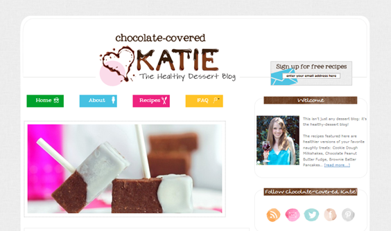
Going into the process, I knew I wanted something bright and cheery – but also whimsical yet modern, and youthful yet grown-up. (Contradictions galore.) It’s taken many months of hard work to get here, and I am so excited with how the design finally turned out! Perhaps one of my favorite parts of the new design is how organized it is:
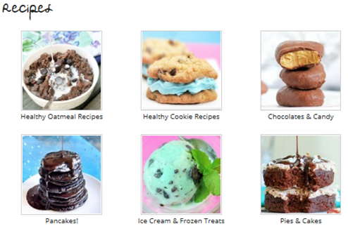
For example, the new recipe page is incredible!
A picture of every recipe! Plus there’s a fancy slideshow on the homepage, and the sidebars are much less jumbled now. If you think I managed these feats by myself… you are giving me way too much credit. Allow me to introduce…
Julie Farber from Deluxe Designs.
Julie is amazing; I wish I knew half of what she knows about web design. Julie can design your entire site for you if you don’t want to worry about a thing. In my case, however, I preferred to be very involved, and she was ok with that, too! I drew up elaborate screen shots in Photoshop of exactly what I wanted—right down to the color scheme and layout—and Julie took it all from screen shot to real-time website without crashing anything, which I would certainly have done if I’d attempted it without help. She was patient and non-judgmental, while still offering sage web designer advice. (You can thank her for the fact that there are no giant polka dots on the top of the page: one of my not-so-bright ideas she talked me out of!)
And those beautifully-organized new photo pages I mentioned earlier? All Julie’s work. I can’t tell you how many things I asked for, while being almost positive she’d come back and tell me such things weren’t possible. Yet every time, she instead responded—quite quickly—she’d made the changes. In short, if you need design work for your food blog (or photography blog, company website, etc.), Julie is your girl! EDIT: Julie will give a 15%-off discount to anyone who mentions CCK in his/her inquiry.
Still to come:
1. The heart logo: The header that you see now is an interim thing, so don’t worry if you’re not big on the heart; it’s not staying! I am not big on it either. I’m a perfectionist and haven’t been able to come up with the perfect logo yet, so I quickly designed this shutterstock-esque heart logo to stand in. The rest of the new design was ready, and I just didn’t want to wait any longer!
2. We’ll probably be making more minor adjustments in the next few days, so give the site a little time to adjust. And Julie is working on perfecting the mobile version of the website as well.



Erica { EricaDHouse.com } says
I love it! Very clean and easy to read. Congrats on the new changes!
Tiffany says
Hi Katie,
I love the new site! Everything looks great, your dedication and hard work really shows. 🙂
Mandie says
I love it, Katie! Julie has done a marvelous job so far 😉
It is very clean and more organized, and easier to navigate. I love the fonts you have chosen too.
It took a little longer than usual for the website to load yesterday, but today it was fine.
Great job!
Michelle says
Looks great! I love it!
Ashley @ My Food N Fitness Diaries says
Very nice! It’s very clean looking yet still has some bright color to it. I love it!
Natalie (@fashionatalie) says
Oh my goodness, Katie! Stunning, love it 🙂
Ann says
I love it, it looks clean and easy to read and look forward to your updating, thanks Katie for all your wonderful ideas.
paulina grunk says
cute!
Ali @ Peaches and Football says
It looks great! I love all the color and it’s still clear and easy to find what you’re looking for!
Jennifer @ Peanut Butter and Peppers says
I love it! I love your header!! It looks so nice!! 🙂
Victoria says
I love it, Katie! It looks beautiful and it doesn’t have any bugs 😀
Dawn Laughlin says
I really like it, its clean and easy to navigate & read but still fun! Great job!
Emily McIntyre says
It looks wonderful! Congratulations.
Nicole says
I really like it! At first, I had trouble looking at the website from my phone, but the kinks seem to have been worked out because it looks great now!
Alexandra says
I love everything about it! And I love that picture of you, you are adorable!
Jess says
It looks beautiful!
Stephanie says
I really like it! So fresh! But I would really like it more if you were holding a mug that says “cocoa” or “hot chocolate” in your welcome photo. More applicable to the overall theme. Yes?
Erin K says
I love it! It looks so much better! Much more professional.
One comment. I wanted to comment and tell you and I had to hunt quite a bit, and then go into the individual post, and even then had to scroll to the bottom to figure out how to post a comment. Maybe a link on the home page with each post?
Georgia says
Same here…I thought at first that I wouldn’t be able to comment, but then realized that I had to click on the post itself, then scroll down to comment. But other than that, I love the new design! And the melted, dripping chocolate look on “Katie” in the header? Makes me want to get something really chocolate-y…and fast.
Julie says
You should not be able to comment from the homepage. Katie’s requested we have a link at the bottom of the post, but you should not have to click on the individual post in order to comment anymore. Thanks for your feedback!
Julie says
Oops! I mean you *should* be able to now!
Harsha says
Sorry but I still don’t see it. Like others even I had a bit of trouble figuring out how to comment so being able to comment from the home page would be nice. I don’t see a “comment” option from the home page, maybe I am missing something obvious.
De says
I had the same problem when I came to comment that the header has disappeared. Also, the header has disappeared, it’s just a blank grey space up there, but the header link to the homepage still works. FYI. (Chrome on Ubuntu)
Amber @ Slim Pickin's Kitchen says
I had the same exact problem yesterday! Glad to know it wasn’t just me 🙂
Alanna says
LOVE IT — great job, Katie and Julie!
Jenny says
adorable!
Lissy says
the site looks great! I think set up a smart phone friendly site for your blog would also be a good idea, I love to read your post on my phone, but the new site is a little harder to read on it. Love your blog and can’t wait to see what other changes will be coming!
Fab says
Fresh, supertight (englishdutch), love it!
katie says
New site looks FABULOUS, just like you! <3
Sharky says
It’s lovely, and it’s making me even hungrier than your old site design! So that’s success for a food blogger, right? 🙂
Crystal says
Looks great! I love the bright and clean color scheme and your new photo is cute!
Stephanie says
I like it a lot. The recipe organization is great (though I think some pictures may not be matching their posted title).
It is loading kinda slow for me though. Slower than it used to. Maybe it’s the amount of pictures when clicking on the different categories.
chelsea says
Great new look! I LOVE YOUR SITE! Its become my dessert Bible over the last year 🙂 thank you!
Kim @ She Wines Sometimes says
I love the new design! I tried to stop by this weekend and the site was down, so I was excited to see the changes you were making! It looks just like you described, grown-up and youthful, whimsical and modern, and super cute! 🙂
Deanna says
I like the new look! it is always fun to freshen things up. I like how it is a clean, uncluttered design.
I view your site through my Android tablet, and I usually use the desktop view rather than the mobile view on websites. For some reason, the sidebar on the right is really wide… about 50% of the width of the whole page. In your snapshot, the sidebar looks nice, narrow, and tidy. I am sure your designer can solve the problem easily.
Julie says
Hi Deanna!
I am working on getting the site to be more mobile responsive. This site is highly customized and as such, as you can imagine, with several different types of devices using different browsers, all with different sized screens it takes quite a bit of work. But I appreciate your comment and will certainly work on addressing it! Thanks.
Deanna says
I totally understand, I do a little website design on the side myself. The thing that made me let you know was that in the regular desktop view it still wasn’t correct. Not criticizing at all! And I am totally patient about these things. You have done a great job! It really is a challenge to meet the needs of so many browsers/devices these days.
Deanna says
FYI… just checked, Chrome, newest version – on my laptop… same issue.
Honestly, I truly love this new design… and yet… no matter what it looked like, I would still come to read because I love Katie’s personality and recipes. 🙂 And the photographs… make me hungry. I tried taking some photos the last few days just for my personal cookbook I keep in the kitchen, and discovered that photographing food in an appealing way really isn’t very easy! This new design really compliments everything I love here.
Joy @ Caspara says
I love it!! So fresh and fun!!
Debbie says
Katie the new site is amazing! Very modern and fresh. The pop of colors at the top against the white are really fun and display the energy you give us everyday! Julie did a fantastic job!
Andrea says
I love it! All the white makes it so clean and uncluttered, and I love the recipe section!
Two things I wanted to mention:
Some people already brought this up – it wasn’t easy to find the comments for the post.
Also, I’m not a fan of the slideshow at the top of the homepage. It’s a bit big, and when I get to the site, I have to scroll down before I can start reading.
Just my two-cents! Great job!
Olivia@ OmNom Love says
I love it! It’s so organized and bright. But I do miss the purple background a bit. Maybe use a lavender instead of white?
Kelly @ Hidden Fruits and Veggies says
I think it looks great! You definite hit the whimsical-adult-etc contradiction on the head! It looks a MILLION times more amazing than before 🙂
Is there a “comment” button on the main page I’m missing? I like that I can read the whole post on the main page, but then I have to open the post and re-scroll to the bottom to post. I might be a little abscent minded, because I forgot what I was going to post and had to re-read a little 😀
Hailey says
Hey Katie! Just so you know, I can’t see the header! It’s just plain white 🙁 Otherwise I love the new design 🙂
Julie says
Hi Hailey (that’s my daughter’s name!),
Do you mind telling me what browser you are viewing Katie’s site on?
Hailey says
Sure! I use internet explorer 9 (64 bit) for PCs.
Julie says
When I render the site in IE 9, the header appears just fine. I will continue to look into it but I wonder if you see it header now? I want to make sure everyone can see it!
Hailey says
I still can’t 🙁 I’ll try to let you know when/if it pops up!
Harsha says
I use IE 9 too and I can see it fine (I can see it fine in all browsers for that matter including safari)
Marisa says
I can’t see the header either in Safari 5.1.6
Julie says
Updating to version 6.0.2 might help the Safari issue. I’ve rendered in all browsers and there do not appear to be any coding issues. But we’re not ignoring this…
Marisa says
I didn’t update my browser but it’s working now!
Chocolate-Covered Katie says
GREAT! We are thinking it might just be that things were loading particularly slow because of a big surge of traffic due to the new launch and that caused some small issues. I’m *still* looking into it just in case that is not the reason, but I’m glad to know it’s working again! Thank you for your update!
Julie says
Sorry, that was from me 🙂
Naomi says
absolutely gorgeous! good job 🙂
Lea @ Greens and Coffee Beans says
I love the new design! Everything looks so clean, and I love that your name is chocolate covered!
Leslie Sweet says
Katie, I love it! I really love all the content you have on the home page without it looking too cluttered. That’s hard to do! I am impressed! But you never really cease to impress me!
Chef Amber Shea says
The new site is gorgeous, Katie (and Julie!)! I actually love the chocolate-splatter-heart logo. 🙂
Kati says
Hi CCK! Love the new site 🙂 But I’m wondering if some bits of posts are missing now…for example, I was just browsing oatmeal recipes (I’m addicted) and I noticed here that the “note” you mention in the recipe is nowhere to be found: https://chocolatecoveredkatie.com/2011/11/10/coconut-cookie-dough-oatmeal/
Also in this one, you mention ‘flakes’ and everyone in the comments writes about kamut flakes, but I don’t see you talk about kamut anywhere in the post: https://chocolatecoveredkatie.com/2009/03/12/when-is-a-snickerdoodle-not-a-snickerdoodle/
Just thought I’d let you know! Love the new look!
Julie says
Kati,
If you view Katie’s new oatmeal recipe page (https://chocolatecoveredkatie.com/category/oatmeal-recipes/) you will find the coconut cookie dough oatmeal recipe. You can now view recipes visually or you can search and should be able to find the recipes you are looking for.
Chelsea says
I love the new look! It’s a huge improvement. 🙂
Deidre says
I love the new site! It is so beautiful!:) So clean and fun and yet grown-up! Great job both of you! You both have such great ideas:)
When I pull it up on the smart phone, I have to do a dramatic zoom out to see the full page. I *heart* how all the recipes have pictures:D! Oh but some pictures don’t really match? For example “Spring Green-Saag” recipe has a picture of ice cream? Hehe! It’s funny though:D I was a little bummed when I couldn’t scroll to look at all the recipes under one category and had to click for “Next Page”:/ Also I couldn’t find some things like the “Special Diet” page for the people with allergies and stuff.
But over all well done! It is marvelous:D <3 I love it!:)
Chocolate-Covered Katie says
Diedre,
We added the dietary needs link back to the recipe page for those who prefer this search and I have made it so that you can view up to 45 recipes on each category page (upped from 36), so this should help you 🙂
Deidre says
Yay! Cool!:D You’re awesome!;D
Shay says
It looks amazing! I love the way your name is drenched in chocolate on the header:)
I will admit that i kind of miss all the pictures of chocolate on the header, but it looks so professional and awesome now that it doesn’t really matter!!! Amazing job!
narf7 says
This one is a winner 🙂
Katie @ Peace Love & Oats says
oh geez, haha, changing all those recipes to be printer friendly sounds like it will take a while! I love the new look though – very modern, clean and fun!
Jessica says
It looks good! Maybe I’m missing them, but I would like it if the posts were dated so we can see when you posted. I agree with other comments, the comment button is hard to find.
Julie says
We hear you! 🙂 We’ve taken your comments into consideration and added the comment button at the bottom of posts on the homepage!
Lynda says
I love the new look of the website! Very cheerful as you said….I haven’t checked out the Recipe page yet – looking forward to that:)
Kristen says
It’s so great! Nice work!!
Heather says
Hi Katie,
Thanks for sharing your new design. A couple comments I have though are in regards to searching.
1) Is it possible to move the search box higher up in the sidebar, or even to put it in the top menu bar along with the Recipes, FAQs, etc?
2) Have you considered using Recipage, or something similar? I often search by ingredient and have a lot of trouble doing so on your website.
Jes p says
Awesome new site, I would recommend making the comment area at the top rather than bottom of page…its hard to find this way…peace!
Pam says
I like the new look as well but I can’t see the header either, it’s all white with a box in the top left corner (sign up) and boxes @ the bottom (home, about, recipes, FAQ). I use Google Chrome.
The Vegan CookieFairy says
LOVE IT!
Julie says
Hey CCK readers! Thanks so much for your constructive and gracious comments! We are continuing to iron out the kinks and appreciate your feedback. Be sure to use the most updated version of your browsers in order to view the site properly and try to clear your browser cache if you still cannot view it properly.
We will continue to take ALL of your feedback into account and help to make the site even more incredible!
– Katie’s designer 🙂
Nikki says
So far, I am not experiencing any viewing problems, but just for general knowledge if I ever do run into problems on any site, how exactly do you “clear your browser cache”? And What does this do?
Great work here!
Julie says
It depends on your browser, but here’s a pretty good list for common browsers: http://kb.iu.edu/data/ahic.html
There are several reasons to clear cache, but in this case, computers tend to “remember” the way a site looks, and when changes are made, sometimes you can’t see the new changes. The cached version of the site will be removed so you can see the updates. The more important thing is actually to make sure your browsers are updated. It is hard to make sites compatible with every browser out there, but virtually (ha ha) impossible to make it compatible with both outdated and updated browsers. Good question!
Kim says
i am probably one of the ones who doesn’t really like it. ;(
Gi says
awesome job… perharps the background is a tad too shiny-and-white, but I reckon that white-and-simple stuff, Apple-like, is very trendy now, so I think i’d better get used to it 😛
Ps. just wondering, why no polka dots? I like them! Everybody loves them!! 😀
Kei` says
I love ittttttt~~ it’s absolutely beautiful! :3
Mallory says
I actually love it!! Even the heart =)
Sarah says
I love It!!!! I love change and i think it looks great!!! ♥
Allison says
I LOVE it. Absolutely love it. Congratulations 🙂
Eating 4 Balance says
Everything looks great! I love the new recipe page. Some funny, nit-picky things though. Some of the pictures don’t match up with the recipes (I think there is a picture of gumbo for a pudding should be?). Also, I don’t know if this was on purpose or not, but when viewing blog posts, I liked being able to see the date that post was published under the title. As far as I can see, the posts don’t have the dates on them anymore. Just a thought!
Tash says
Looks fantastic! Love it, so clean and fresh looking 🙂 Im also a fan of dated posts!!
Ladylike says
I am impressed! It is like the website grew up together with you! It is very cute and organized, as you said!
Lindsay @ The Live-In Kitchen says
Love the new site, so much easier on the eyes! My one criticism would be the photos on the recipe pages. Many of them are skewed a bit and some have a weird double photo peeking through on the bottom that I think would look better just cut off. Otherwise great though, congrats on the redesign!
Emma says
Definitely like it! So much better than the old one- much cleaner and more suited to the professional you!
Maybe you should replace the heart with a choc-chip cookie 😀
Lisa says
I love the new look, it looks amazing. Clean and organized!
Kristie says
Adorable, unique, clean, simple, sophisticated…so basically perfect. I love it!
(Then again I don’t think I’d be turned away from your site no matter HOW you designed it so long as you kept pumping out the same amazing recipes and Katie-ness that you always do. But still. This new look is great!)
Mariann says
Congratulations – I love it!! 😀
Brandie says
It all looks great Katie! I know you’ve been wanting this for a long time, congratulations!
(I’m looking forward to the print option on all your recipes too!)
Katie says
I love the new layout! It’s so pretty and colorful. =) The picture recipe section is the best and easy to use.
Keri says
I like it a lot! Great work! 🙂
Crystal W. (@EatDrinkClev) says
I love it! I need to get a serious overhaul of my blog but am in the middle of planning my wedding. After that – I hope to have something even 1/2 as awesome as yours. Congrats!
Hannah says
Love, LOVE, *LOVE* IT!!!! Weird thing was, I noticed all those elements you mentioned (youthful, grown-up, whimsical, sophisticated, etc.) and thought how well it all went together and how much I loved the fact that you could incorperate so many seemingly paradoxical design components into one cohesive, beautiful blog! My sisters and I are just thrilled with the happy new design…it makes us smile! The recipe pages are amazing (one of my favorite parts as well), but I must say, I love the heart logo…it’s so cute and fun! 🙂
Nikki says
Great look! Love the clean, simple yet bright and cheery look of it! The header is definitely a big improvement. I LOVE how you get a little pic of each recipe in the recipe index!
Nikki says
I love the white. So much brighter and cleaner. Makes me want to stay on your blog EVEN longer… hmm, that could be dangerous!
Danica @ It's Progression says
LOVE it!!!
Lauren says
LOVE LOVE LOVE LOVE LOVE LOVE
Lauren says
P.S. I even like the heart in the header! 🙂
Lena Shore says
Looks great! The organization will really come in handy!
But, ask Julie about a plugin for “print friendly” or have her make the site print with a little extra CSS. You shouldn’t have to redo all the recipes. (:
Naomi Frash says
So long as the content doesn’t change, I will still be on board the CCK blog boat
Jenny | Floppycats.com says
Bravo to you! I am overhauling the look of my site and it’ll launch on it’s 5th birthday on Feb 22 – I am totally excited and anxious, as I am sure you were. Beautiful job – I do like it more and feel more dessert-y now!
Irus says
I hate you and your new site.
Quin says
I love the new site! Its much more organized now! I think a good change to add would be adding step by step photos to each post.
missnah says
Love the new design! Remember seeing it this weekend and thinking how great it was 🙂 just two comments, one is the comment thing various people above had mentioned and the other is just me wondering if you are still working on the recipe page cus i.can’t easily find recipes at the moment, although glad to see the search feature is alive and well 🙂
Seriously though, it looks so clean and fresh, well done!
Laura@ Fit Running Mama says
So Clean and pretty! Looks amazing!
Anna @ Your Healthy Place says
I LOVE your new site design – especially the comments box and the clean white layout. I actually really like your header with the heart too! If there was a photo of you incorporated in there somewhere, or one of your amazing food creations, that would be even better. But I like the logo idea!
Your designer sounds amazing too. I just came through relaunching and designing my site and my designer was also eternally patient, poor thing. I bombarded her with questions! But you gotta live with the results, right??
khursten says
It’s so much better! Great job to both of you! Love everything.
Sam says
Congrats, you go girls!! Just on a side-note: The recipe pictures don’t always match the dish. If you browse through the healthy meal plan section, for example, you’ll see what I mean, lol 🙂
Best,
Sam
Alan Kleesattel says
Hello,
The new website is great but I do have one thing I would like to mention. I like the slide show on the homepage however for me it is the the only thing I see in the stream of new posts. Personally I like to be able to see at least the top of the first without having to scroll down. Maybe the slide show could be incorporated into the header or off to the side or smaller? Just a few ideas but overall it looks great, congratulations and the work is great.
Jennifer Grimm says
I really like it…love the heart also 🙂 The photo slide at the top took a minute to switch pictures though…other than that there doesn’t seem to be anything wrong! Love it!
Sara Ann Burroughs says
I LOVE it!! It looks awesome!
Anonymous says
I’m In love!!! Love the chocolate dripping ‘Katie’
Haley @ fullnfit says
LOVE LOVE LOVE! It looks fab <3
Brandon says
Love the new design, Katie! Looking forward to your same quality that you constantly give. Thanks for everything!
Heather McClees says
Katie- I LOVE IT! It is perfectly you! I love the font too. So up to date and perfect for your voice and blogging style. Don’t change a thing ! You said you hated the heart- a cupcake would be so cute there instead!:) Just an idea- I LOVE IT!
Cassandra says
It is definitely bright and cheery! Your archive drop down menu is hard to read, though. 🙁 The font is so pale against the white background and I have to get closer to my screen to really be able to read it. Love your new profile picture!
Hannah Harper says
Wow! This is really… Amazing! I was a bit unsure whether I would like the new blog, as I really liked the old one, but I’m totally bought!
Lauren says
Im not sure if anyone pointed this out but it looks a little screwy on the iPad.
Julianna says
Katie I LOVE IT! Congrats!
Jessica says
It looks great! Very clean : )
Karla says
Not seeing much of a header and what looks like is supposed to be in the side bar – based on the photo you have posted – in my browser (google chrome) it’s on the footer below the comments.
Anonymous says
This is really beautiful! I love the organization and aesthetic of the design.
alloyjane says
Wow! This is very exciting. I like it quite a lot. Clean and accessible. Can see everything fine, haven’t tried searching yet but I’ll try to do that later and see if it’s intuitive. Great job ladies, can’t wait for the updated header. BUT. The one thing I was hoping would change was having the comment box underneath the blog post rather than underneath the comments. That would be excellent. Is there any particular reason why this box is at the very bottom?
Julie says
I like that! There was no reasoning behind it other than it was default for the theme. I just changed it as I agree it’s more user-friendly not to have to scroll all the way down the comments. Thanks for your input.
Kayla says
I can’t wait until the mobile site! I visit your website on my iPad.. And other than your screenshot, I can’t see the logo at all and not everything loads. From your screenshot, it looks like it’s lovely on a computer. I’ll have to look in class tomorrow when I’m supposed to be researching a music genre. 😛
sara @ fitcupcaker says
Love the new blog….I need a makeover for mine already and its only been 3 months!
Sara Weis says
Love your site and recipes! Never have posted before but felt compelled. I think your profile pic should have you holding something chocolate instead of a glass of wine. I really like your new header. Great work!
Hannah says
Looks amazing Katie!! (Sitting on the couch drooling over your recipes with Michelle and Danielle)
xoxo
Chocolate-Covered Katie says
Hi Hannah!
Haha at first I was like, “Who is this person, and why is she referencing people named Michelle and Danielle as if I know them?” 🙂
Anonymous says
hahaha – yep, Michelle as in your sista 🙂
Chocolate-Covered Katie says
Oh right, I do have one of those!
Tell her I said hi. And be sure to boss her around as much as possible, because I am not there to do it :).
Ariella says
looks great!
katie z says
Looks great, Katie! More professional & clean. Looks like you & Julie collaborated well together! 🙂
Sarah says
It looks really great!! I love the simplicity of the new one. It’s less visually distracting.
Jessica says
Great job with the changes, I love it! …to say that I’m obsessed with your blog would be a huge understatement lol 🙂
Clare says
I am finding the header won’t load properly in Firefox or Chrome.
Mary-Stewart says
ADORABLE!!! I really love it!
SELAH says
I love it, BUT it was definitely loading VERY slowly, especially on my iPhone and iPad. Also, I had problems with Firefox and Chrome as well. But overall, very cute and clean!
Valentina says
LOVE, LOVE the new look! 🙂
Hannah @ TalesFromTheLastFrontier says
I think the new layout is great!! I really like the chocolate letters, great touch. And, as always I loooove your healthy dessert recipes.
Lynn says
I really like it, Katie! It’s bold and eye-catching, fun and friendly. I think you accomplished all you set out to do with it! I even kinda like the heart! 🙂
Jess says
Love it Katie!
Lisa B says
I LOVE it!! it’s so bright & cheery 🙂
hamy says
love it!
Old design always reminds me of 2D games we use to play in childhood
😛
KellyW says
Awesome! Simply, awesome.
Anonymous says
Love the site, but I wish it had a mobile version or is a responsive layout.
Thanks! You’re working hard! <3
Anonymous says
Nevermind I didnt read the last part!
Abby says
It’s looks fabulous! Great job!!
Jill K says
The site looks great….I can’t wait to scroll through your recipes again (and again!!). Congrats and continued thanks for the great recipes and information!! Jill
Kathy says
Absolutely adorable. And personally, I do love the chocolate heart!! I think I owuld have liked the polka dots also!! Modern, whimsical and fun!! Good job.
Janice says
Katie, you and Julie did SUCH a nice job on the website re-design! One thing (not a criticism, just a note!) I liked from the previous recipe page was when you included that the item was a ‘reader fav’. It sometimes helped me decide whether or not to try it out for myself!
Also, I just wanted to let you know that I had just started following your blog last year when I decided to try to go egg/dairy-free (I’m already vegetarian). Your website has been such a godsend in helping me transition, because I have such a love for chocolate and sweets. 🙂 I really look forward to your posts and thank you for sharing your love for chocolate and recipes with me. I’ve even enjoyed going to the old posts and reading them as well!
Kristi says
LOVE the design!
I have had a hard time getting it to work on my smartphone or kindle though. Has anyone else experienced this problem?
Annika Ek says
The new design is really nice. Fun and appealing design and a clear message. Well done!
Annika
Sue says
I love your website!! I even like the chocolate heart!! lol But seriously, I’m new to this site and have spent the last three days just pouring over your blog. I’m truly addicted!! Thanks for all you do to make this site so absolutely wonderful and delicious!!
Karen says
Looks fabulous. And SO your spirit. Congrats!
Eva says
It’s nice in the browser, but much harder to use on the phone than before.
Becca says
As long as you stay you, I will be happy with whatever web design you come up with! Although I am rather partial to this one 🙂
Jana says
I personally love the little heart! The chocolate dripping down the letters of your name is so perfect. I’m a girl after your own heart… i love all things chocolate! Great job!!!
Sherisse H (@lovesplantbased) says
Great look! Very fresh, clean and organized!
Amanda C says
I love it, looks more updated and sophisticated. I actually really like the heart logo and think you should consider keeping it.
Ashley Bee (Quarter Life Crisis Cuisine) says
Really great re-do! Better picture of you too.
gracie says
I like it! Very cute! would love not to have to scroll over to see the side bar though.
The recipe page is AWESOME!
kimmythevegan says
Looks fantabulous!!! I kinda like the heart =)
Steph says
Super cute but it doesn’t look completely right on an iPad!
Shayna says
It looks great so far!!! Thank you :))
Liz says
Could you include the date you post a new entry? For some reason, it makes it so much easier to navigate.
Ruta says
It looks awesome, Katie! I love how fun and user friendly it is. If you don’t mind me asking, about how much did the new design cost you? I’m looking to give my blog a bit of a facelift and was wondering what it was cost wise. Thanks so much!
(it’s also totally OK if you don’t feel like sharing!)
Clarissa says
I love it, it looks great! Very bright, fun and user friendly and professional looking!
Celia Petersen says
I absolutely LOVE it!!! It looks super professional and cute!
Sarah (appifanie) says
I like it a lot! I feel like there should be a picture next to or behind the title at the top, but other than that it’s perfect for you!
A says
Love the new look, Katie and Julie.
But, one small gripe – the new website is nearly impossible to view on a mobile phone.
One has to scroll left to right to view it all on one screen. I use my phone a lot to navigate to your site. So, it was kind of a minor irritant 🙁
Hope you will look into it.
Deborah Maxey says
Katie, this is really nice. Congratulations! I love your recipes and I’m a vegan recipe snob! This does you justice!
Chelsea @ Natural Sweet Recipes says
LOVE!!! Love everything about this new design. Great work! I even like the heart- it’s a cute idea!
Trish says
It’s great! Love the new look! It is so much more clean looking, organized, and cheerful. And one thing I had wanted for a while was the pictures to go with each recipe IN the index. SO AWESOME! Thanks for the user-friendly update! Congrats!
Kathy says
About the new website….one word…professional! I know you said you were changing the heart logo eventually, but I for one like it….a lot. Great job, Katie.
Lauren says
I love this! I think the logo would look really cute as a mixing bowl with a wooden looking spoon sticking out of it. 🙂
Milounette says
I love your new blog design, I find it much more prettier and modern than the older. Your index page is also very convennient and it’s much more easier to find your recipices.
Jen says
I LOVE the heart!!! It’s quite appropriate for those who truly LOVE food (like me). The changes are beautiful. As stated by other readers, it is easy to read & the sidebars do look better. Thank you for putting so much work into your site. It is one of my favorites & I send ALL of my clients to your page for healthy treats. 😉
Rhiannon says
Hi Katie, loving the new look and feel. The website is much more difficult to view on small devices such as iPhones, as it doesn’t auto resize like the old one. It’s trickier to navigate and read now on a phone xxx
Bek @ Crave says
Love the new look of the blog!
Anonymous says
Just a note: On chrome, if the window isn’t wide enough the sidebar goes to the bottom of the page and the posts go wonky and the margins expand so that you have to scroll sideways to read the them.
Jody says
The site is looking good! I actually like the heart logo, I think it looks really cute and goes with the “chocolate covered” part.
Rosemary says
Positively lovely! The new logo is adorable!
Donna says
I love the new site. I think its bright and clear!!! I am not a vegan, but love the recipes for healthier options. I do have friends though that are more vegan than me ( does that make sense?) so I have been turning them on to your site. Thanks for all your hard work.
Karin says
I’m totally new to blogging. Yours is the only one I have ever consistently read. I mean, come on, you are sharing some seriously important info here!! I really love how clean and still dripping with chocolate the new site is. It’s so easy to navigate. I just started a blog a few weeks ago and look to yours for guidance on organization, etc. I blog our eating habits for my friends and family, so I just used a weebly template. It’s for techno-dummies like me. If I ever decide to invest myself in my blog the way you have, I’m sure I’ll look up your designer. Well done!!
jayna says
love it!
Ellie Manuel says
Hi again!! Before I sound like I am complaining let me explain that I access this site 5 times a day, every day. Seriously, I don’t eat anything that is not made of this site. The more I keep accessing the new site the more complicated it seems…haha! Is it at all possible to include a link on here to view the site in old format??
TexasLea says
This looks awesome Katie! I have always thought your blog was stellar just for it’s content alone, but now you have a blog design that matches the content. It’s just as yummy as one of your sweet creations.
Kate says
I like how everything looks now on the Home page, but I dislike how the Recipe pages are now. While they look nice, it is frustrating to have to sort through 5 pages of candy recipes when I’m not sure what I want to fix. I do frequently use the “Search Box”, so if I’m looking for something specific, I will continue to use that. However, when I’m just poking through the recipe collections, I would prefer to see everything in one category at once (or at least a bunch of stuff at a time.) I really liked how they were right before the big change.
Oh, and one more thing, I’m so happy that you included “Breakfast” as a Recipe category! My companion hates eggs, that’s what got me hooked on this site- eggless breakfast goods!
Keep on keeping on, Katie. I love what you do!
Mimi Maldonado says
Congratulations on your hard work. And yes it is so much nicer and professional now. Looking forward to what is to come!
barb says
will be happy to see printable recipes—I hope there will be a no-photo option (save on that expensive ink). Also, I hope measurements will be given in traditional units—cups, teaspoons, etc. I have no way to measure grams???
love the recipes, healthy deserts—who knew???
Jessica says
I have another suggestion. What about a button to go to the previous and the next blog entry? I’ve seen it on other blogs. It’s not a must, but it would be a nice addition!
Also, for your future recipes, could you start posting more details about how the texture/look of something should be after you’ve mixed it, and what it should look like when it’s cooking/when it’s done? I’ve tried several of your recipes and I am always unsure about whether I’ve mixed the ingredients together correctly (like if I need more liquid/flour/etc) and then I’m never sure when to take things out of the oven (due to oven variation).
Thanks!
Alexi says
can you make a TVP(textured vegetable protein) recipe?! I made a chili using it and it was so delicious! I’m now hooked and curious as to how else I can use it!!
Anne-Alexandra says
I love your new design ! It’s clear and classy and beautiful ! Congratulations to you and Julie. =)
Chocolate-Covered Katie says
Thank you so much!
Lyzz says
I love the new site design! It’s so clean and clear, and all the pictures are lovely!
I do miss the ability to browse from post to post in order. Right now I’m on this post’s “page” and there is no navigation option to previous or next post. Thanks!
Shauna says
I love the new site! However, for some reason half of your “title” is cut off on my computer. All I can see is the bottom half of “Katie” and the rest of the title below it. Hmmmm….
Chocolate-Covered Katie says
Is it showing the ads over the header? What browser are you using, and how long has this been going on? If you get a second, can you try clearing your browser cache and letting me know if that worked?
Shauna says
I’m using Google Chrome…this is the first time I’ve been to the site since the change. There aren’t ads covering it, it’s like my browser window cut it off right at the top, like it’s scrolled down a bit but I can’t scroll up to see the rest, if that makes sense. I’m going to try another browser!
Shauna says
UPDATE!! Internet Explorer works fine…guess it just doesn’t like Chrome. Oh well, I’ll just have to deal!
caoimhe says
I just wanted to post a comment, my first one incidentaly, to let you know that I swear by your blog. I am always looking for low calorie, inventive, sugarfree desserts and I find your blog easy to use, well laid out, with incredibly tasty recipies!Thank you so much for all your hard work!!
Kim says
Good Afternoon Katie. I love your recipies and your new website is great. I have one suggestion for you. When you print the recipe maybe add an option to print the nutrition facts along with the recipe so they can be printed at the same time.
Thanks for listening.
Kim